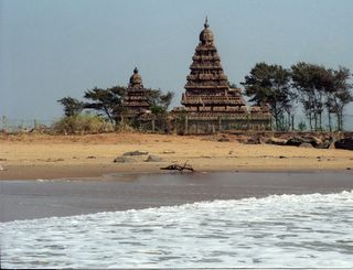
Repeating shore temple post for Stamps of Chennai Series. I had always wanted to take this pic of the shore temple with the waves in the foreground, a duplication of the stylised version of the shore temples that we see in many drawings and in the stamp above. But the sea and waves were simply too far away from the temple and separated by a wall of boulders. Finally, when this image happened I had no reason to be happy. This picture was taken on December 27, 2004, the day after the tsunami.


6 comments:
i feel something missing in the last frame...will comment again if i find the answer,,,...
have a good day!
Please do. Could it be because I have included too much of foreground and pushed the shore temples back?
I think thats becoz of the temple sitting oddly in the right side of the frame...general composition rule is to keep the subject on the left around 1/3 rd area...(ref. the stamps and also ur perfect framing of the cycle man)...also the sky space above the tower tip is too narrow...sort of creates a tension...
OK. Maybe I got carried away by the idea of getting the waves and the temple together and put too much water in the foreground.
As to the rule of thirds, I do not follow it strictly.
i agree..cant always go by hard and fast rule in art...it has to be done with the flow of it...if u think of doing things by law, u'd lose Spontaneity and its natural charm.
onthe other hand, once u've done ur work, if u study them carefully, the best ones are those that have followed certain laws of composition...knowingly or unknowingly. generally good artists follow the rules of composition without even realising it...examples are ur cyclist photos.
:) OK. Point taken.
Post a Comment